

Calls to action (CTAs) are often treated as an afterthought in content creation, which is odd since they are arguably the most consequential element.
Digital marketers and their campaigns are evaluated through a great many factors, which are growing more deep and nuanced as analytics evolve, but conversions are still the name of the game. It’s the easiest thing to measure and the surest sign that your content made an impact.
With this in mind, it’s probably worth taking a step back and rethinking your CTA strategy. If you’re cruising on autopilot and running a generic “Download guide” or “Request demo” at the end of every content piece, you are probably leaving opportunities on the table to better engage (and convert!) your audience.
“If you’re cruising on autopilot with your CTAs, you are probably leaving opportunities on the table to better engage (and convert!) your audience.” — Nick Nelson @NickNelsonMN Click To Tweet
Drawing from the latest best practices for design, copy, and experience, here’s a rundown of optimizing your CTAs to get more juice out of your content squeeze.
A Guide to Better CTAs: 4 Ways to Compel Action
The first and most important piece of advice is to be thoughtful about CTAs. Give them the attention they deserve as key touchpoints in your marketing strategy.
My dentist once advised me to start my daily brushing routine with the hard-to-reach back areas of the mouth, because that’s often where people finish and they tend to expend less effort as they wrap up the process. Similar advice might help with your CTAs: plan them out from the start so you can build your way to a strong and compelling finish.
Keep these tips in mind when developing your CTAs.
1 — Craft text that is brief and builds urgency
How can you deliver the most enticing proposition possible in the fewest words possible? This is the art of CTA copywriting in a nutshell. Be creative in framing your hook, and try to use words that aren’t generic and predictable.
For example, instead of “Download the guide,” why not say “Snag the guide,” or “Get the goods”? You also might try framing your CTAs around what the user will get out of them, rather than what you want them to do. So instead of “Download the guide,” you could say “Become a [X] expert.”
Language that builds urgency has been proven effective for improving conversion rates. OptinMonster has a helpful list of urgency words spanning several categories, such as time, speed, scarcity, and discounts.
A word of caution: don’t try to create faux urgency (i.e., fake “limited time” offers) or weaponize fear. It’s fine to take the FOMO route, by hinting at what people will miss out on if they don’t click, but marketers should never aim to trick or scare people into taking action. That sabotages trust.
“Marketers should never aim to trick or scare people into taking action. That sabotages trust.” — Nick Nelson @NickNelsonMN Click To Tweet
2 — Be open-minded about the actions you want users to take
CTAs tend to fall into a consistent set of buckets: download a guide/whitepaper, request a demo, access a free trial. These are usually linked to valuable business outcomes, which is why they’re trendy, but there’s a recurring theme you’ll notice in our guidance: that which is different, gets noticed.
Digital guides and demos aren’t necessarily appealing to someone who isn’t directly interested in your brand yet. So what else can you offer that might pull them in? Maybe it’s entry into a contest, or free access to an element of your service, or a personalized digital gift (maybe an NFT?!).
This article at HubSpot features a ton of great CTA examples, many of which steer away from the traditional CTA boilerplates. In particular, I really like this one from Quick Sprout, which prompts a user to enter their URL for an SEO health check …
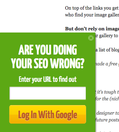
(Source: HubSpot)
… And this one from MakeMyPersona, offering a free buyer persona template and guide. (Note that the decline option isn’t phrased in some way that makes the user feel terrible about clicking on it, like “No, I’m an idiot and I don’t want to learn more about buyer persona templates.” I hate when brands do that.)
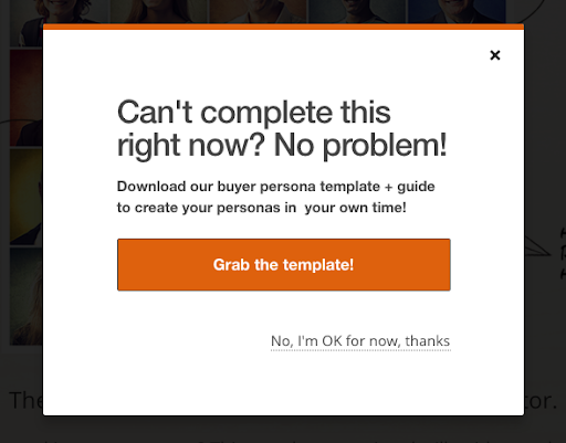
(Source: HubSpot)
3 — Visual choices matter
Saastitute conducted an analysis of more than 100 SaaS companies to gain insight around the most common and recommended stylistic choices for CTAs.
A few of their noteworthy findings:
- Color: The most popular choices for CTA buttons are blue, green and orange.
- Shape: Rectangular buttons with soft rounded edges are by far the most frequent.
- Placement: A majority of CTAs appear on the right side of a page (37%) compared to the middle (29%) or left (24%).
To be clear, this doesn’t mean you need to follow the same approach! As we said earlier, being different is key to standing out, and everything should tie back to your brand’s identity. But the popularity of these stylistic choices are typically vetted out by research.
4 — Make clear what the next step looks like
Uncertainty tends to be one of the biggest impediments in decision-making. Take it out of play by informing users exactly what will happen when they click your CTA.
For example, “When you enter your email and click above, you’ll receive a copy of our guide in your inbox within a couple of hours. We won’t share your information with anyone, and won’t send you any other communications unless you actively opt in.”
“Take uncertainty out of play by informing users exactly what will happen when they click your CTA.” — Nick Nelson @NickNelsonMN Click To Tweet
Not only does this help someone gain comfort in understanding exactly what lies on the other side of the CTA, but it also has a more subtle trust-building effect. You’re making a clear promise and following through on it.
When shaping your brand’s perception in the eyes of a potential B2B customer, what could be better?
A Call to Action for Marketers: Rethink Your CTAs
For the amount of time and care you put into creating quality content, don’t make the mistake of diminishing its impact with a half-hearted CTA that gets glossed over. Find the intersection of best practices, unique brand identity, and user value to create irresistible calls to action and move more prospects into your marketing funnel.
Want to get better at it with expert help? Then here’s a call to action for you: get in touch and let’s chat.
Comments are Closed